Posters for films both old and new seem like they are literally everywhere these days. It’s like the doors on the official cinema archives exploded and spread an incredible range of graphic styles and approaches across the Internet and onto the walls of trendy boutiques. Intriguingly, these visual treats are for the most part unofficial – created by enthusiastic amateurs and professional designers on downtime – and nothing to do with the productions that they reference. So, if they aren’t actually advertising anything, what in the name of Spielberg are they for?
To begin answering this question, let us first understand something of the ethnographical phenomenon of ‘fandom’. History shows that the need to be a disciple of something is hardwired into the human psyche. Today this urge has manifested itself as adoration, or ‘fanaticism’, for entertainment media products, e.g. sports teams, musical personalities or, most relevant to our discussion here, intellectual properties.
The first ‘fans’ in the modern sense are popularly considered to be enthusiastic 19th-century Sherlock Holmes readers, a group so incensed by the killing off of their favourite cocaine-imbibing detective that they organised street protests with enough efficacy that author Sir Arthur Conan Doyle changed his mind and proceeded to have the great man clamber out from beneath the depths of the Reichenbach Falls.
Today we are equally passionate about our favourite characters (the latest incarnation of Mr Holmes included), so that we purchase billions of dollars worth of licensed goods every year, attend countless exhibitions and live shows, watch endless hours of box-sets and still, when deemed necessary, organise ourselves in protest against proposed full stops to our favourite characters’ storylines.
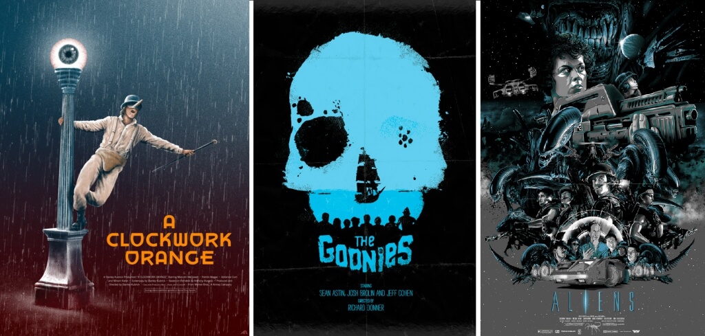
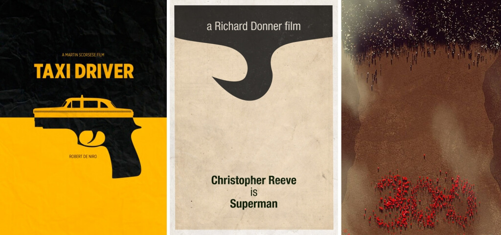
Another response is the urge to create fan art, or expressive personal artworks that use any available medium: painting, sculpture, video, music, fashion et al. It’s an arena where anything goes, as long as it celebrates a given character or property. A sub-genre of this movement explores this maxim via the idiom of the film poster.
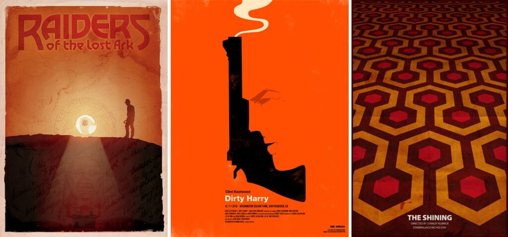
Collectively these have been dubbed ‘Alternative Movie Posters’ (or, for our purposes, let’s call them ‘AMPs’). What started on a small scale has now grown into a widespread fever supported by social media and a host of dedicated websites (Alternative Movie Posters.com, Repostered.com and DeviantArt.com), which enable artists to share their work globally. Films are still a popular enough pastime that the content-hungry mainstream media picked up on the story, bringing it to a wider audience, which in turn inspired a small boom in print-to-order products via popular online stores and high street shops.
Whilst AMPs seem like the perfect output of the social media age, the taste for alternate versions is actually as old as cinema itself. From the late 19th century to the 1980s, it was common for individual countries and individual exhibitors to create their own studio-sanctioned promotional material. As film marketing became more savvy in the light of the unprecedented popularity of certain 1970s proto-blockbusters like Jaws and Star Wars, a standardised, ‘branded’ approach started to be seen, where one set of artwork was distributed globally, differing only by language version. Though undoubtedly good for the bottom line, this development has been much criticised by cineastes for resulting in today’s leaning towards simplistic posters that display no more imagination than that needed to combine an enhanced photograph of a star with some serviceable typography.
It seems possible to say that AMPs are a critique of this practice in graphical form, Simon Hawes of Alternative Movie Posters.com agrees: ‘The generic key art format is definitely a factor in the rise of fan-made posters. People are crying out for more creative work around releases, and I think that is certainly filtering through.”
As official posters increasingly opt for the path of least intellectual resistance, AMPs are clearly choosing the opposite, namely a heavy barrage of clever visual puns and metaphors very often exquisitely rendered. As Hawes sees it, “AMPs allow people to create something totally unique that you wouldn’t get from a studio, as there are no limitations and anyone who can draw, use a computer, or hold a brush and loves movies instantly qualifies to be able to make an AMP. Movies are where you go to escape and be transported somewhere amazing, and I think the sense of creating an alternative poster is someone’s own form of escapism and love for film and art.”
You might expect AMPs to be accepted by all as being the potential of the poster medium released from commercial restraint, but surprisingly, this is not the case. The overt attempt at intelligent and visually attractive audience engagement is often criticised by the combined design industry media – as well as creatives working in the film industry and beyond – as somehow being not real design, something inauthentic and of less worth compared to professional cinema marketing materials.
A common commentary on the Blogosphere is that they’re just ‘hipster wannabe nonsense’, but in more lettered terms, Mike Salisbury (legendary designer of posters for Raiders of the Lost Ark and Jurassic Park, among hundreds more) makes the point that they are flawed because “no one who did them had to go to meetings, read the script, view the research, listen to a lot of voices with opinions and do about a hundred concepts and a hundred more revisions competing with other groups doing the same.”
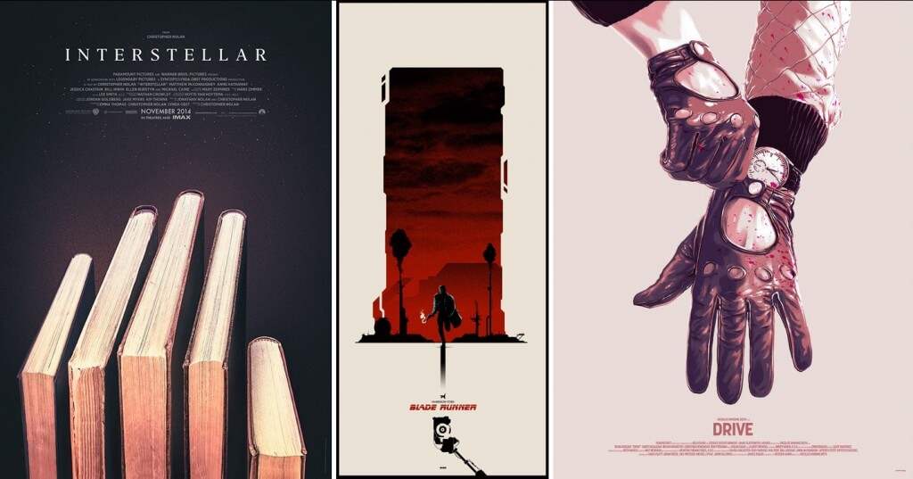
Without any commercial sensibilities informing the outcome, they perhaps cannot be considered true to the requirements of the advertising poster medium, a point furthered when we consider the fact that an AMP operates in a different way to a ‘non-hipster’ treatment. Corey Holms (designer of posters for such small films as The Sixth Sense, Lost in Translation, Watchmen and the legendary Sopranos ident) explains: “The goal of a studio-commissioned movie poster is to create interest in a property that has not been seen yet by the public, whereas the point of the fan-made movie poster is nostalgia. One requires [the viewer] to have no knowledge of the film and is intended to spark an interest, while the other requires [the viewer] to be an expert with a secret handshake. The AMP is reliant on prior knowledge, which drastically changes the way it needs to communicate.”
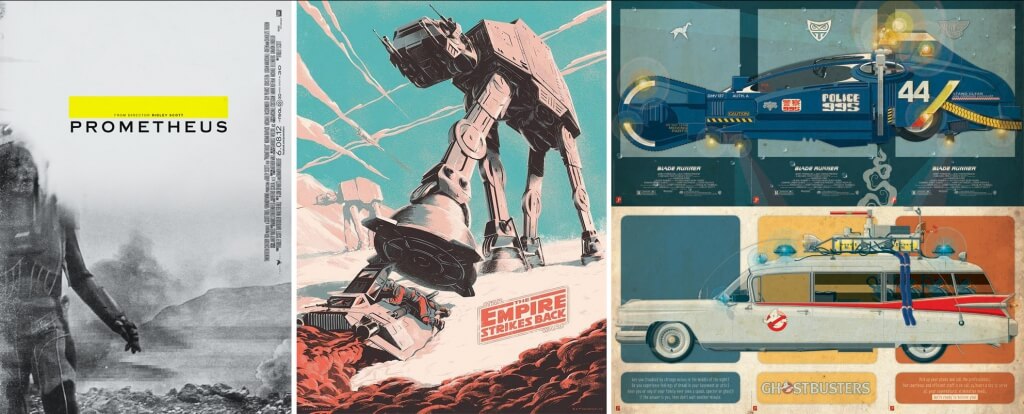
What at first semed like harmless, child-like fun is suddenly starting to get a little complicated isn’t it? A good point to mention, then, is the rather grown-up subject of intellectual property copyright law. This ‘prior knowledge’ is seen often in AMPs’ reliance on presenting iconography from their parent film, such as key scenes or production design, elements that in 2D static form don’t actually make any sense unless you have seen the film. As a result – and whether you think they’re creative or not – it’s undeniable that AMPs are actually basing themselves in someone else’s ideas, with the fairly safe assumption that the copyright owner has not been asked for permission. Every time an AMP artist publishes a new work, they must surely go straight to the letterbox and wait for their cease and desist letter to arrive, right?
The reality is that doesn’t actually happen. The studios adhere to what is known as the ‘unwritten rule’ of fan art, that one upsets your fans at one’s peril. Intellectual property owners accept that, whilst personally they may feel that AMPs are essentially people promoting themselves using other people’s ideas, to stop them would essentially be turning away their own customers, so the studios tend to turn a blind eye to AMPs.
Interestingly, this submissive reaction is now developing into a full-on acceptance of the genre. Fan art is now used to brand special screenings, events and home entertainment releases, most famously when Tarantino posted an AMP for Django Unchained on Facebook, which was then used as an official campaign tool by the studio.
More exciting still is the emergence of new poster style, a hybrid between studio-friendly commercial practicality and the semiotic approach of DIY posters, seen in special edition posters catering for a more culturally aware audience; notable examples include the recent Hateful Eight teaser or the IMAX special edition Star Wars: Rogue One posters.
Influential designer Neil Kellerhouse, creator of posters for Gone Girl, Social Network, HBO’s House of Cards, Finding Nemo and many more, explains his approach to poster design: “I try to take a conceptual approach when I begin a new poster; this idea or concept can then be manifested hundreds of way. After I get these concepts, I try to apply and use imagery from the film or something that’s genuine and authentic to the film and what it’s trying to say. I think someone that doesn’t have access to this official imagery has to use concept and metaphor to create something effective.”
Following Kellerhouse’s line, the AMP becomes a pragmatic way of creating a legitimate visual expression for creatives who aren’t able to call on official asset libraries for inspiration. The question, then, as to whether the worth of a poster is based on its genesis (sanctioned or DIY) is largely negated, with fan art influencing real art.
More intriguingly, does the rise of the AMP herald a paradigm shift in the way society thinks about art in general? Could it be that society is slowing moving away from judging art on what it looks like and towards assessing it on cultic value? This doesn’t mean we should all dress up in robes and masks and dance around an original of a rare Wicker Man release poster (however intriguing that sounds). What this points to is the fulfilment of the original function of art: honouring something through creative representation. The early practice of creating images in celebration of deities, animals or just plain human physical beauty is, in fact, nothing more nor less than fan art. All we’ve done is shift our piety over to pop-culture…
Article by Jeremy Owen
Many thanks to Neil Kellerhouse, Mike Salisbury, Corey Holms and Simon Hawes for their kind contributions to this article.
[POSTER CREDITS: Aliens, Artist: Vance Kelly, vancekelly.com; Raiders of the Lost Ark, Artist: 3Ft Deep, 3ftdeep.deviantart.com; Dirty Harry, Artist: Olly Moss, ollymoss.com; The Shining, Artist: Jean-Joseph Renucci, jeanjosephrenucci.net; Interstellar, Artist: Michal Krasnopolski, michalkrasnopolski.com; Prometheus, Artist: Midnight Marauder, midnight-marauder.com; Taxi Driver, Artist: Bruce Yan, 7two.com; Superman, Artist: Gidi Vigo, gidivigo.com; 300, Artist: Nagy Norbert, norbface.deviantart.com]



Sorry, the comment form is closed at this time.